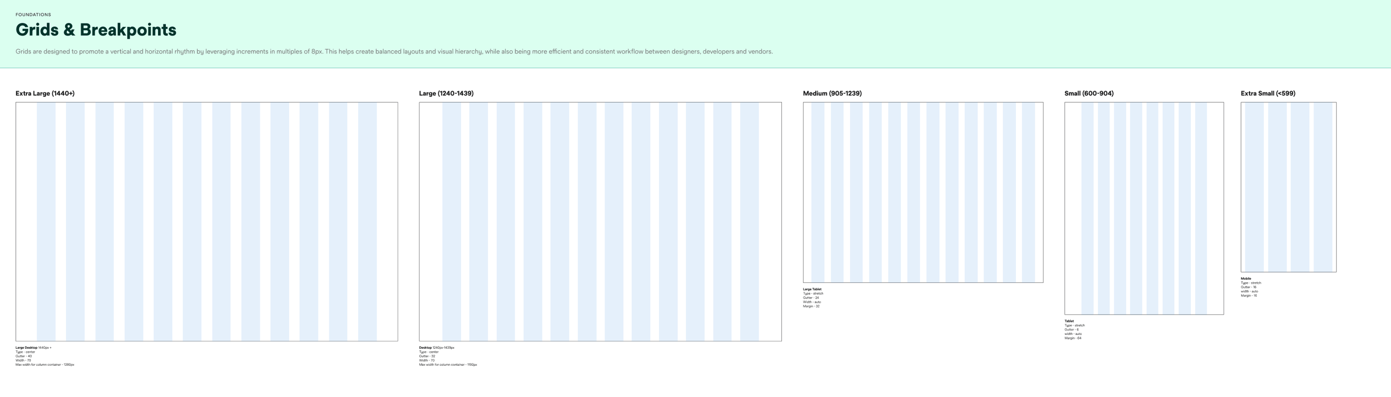
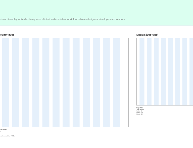
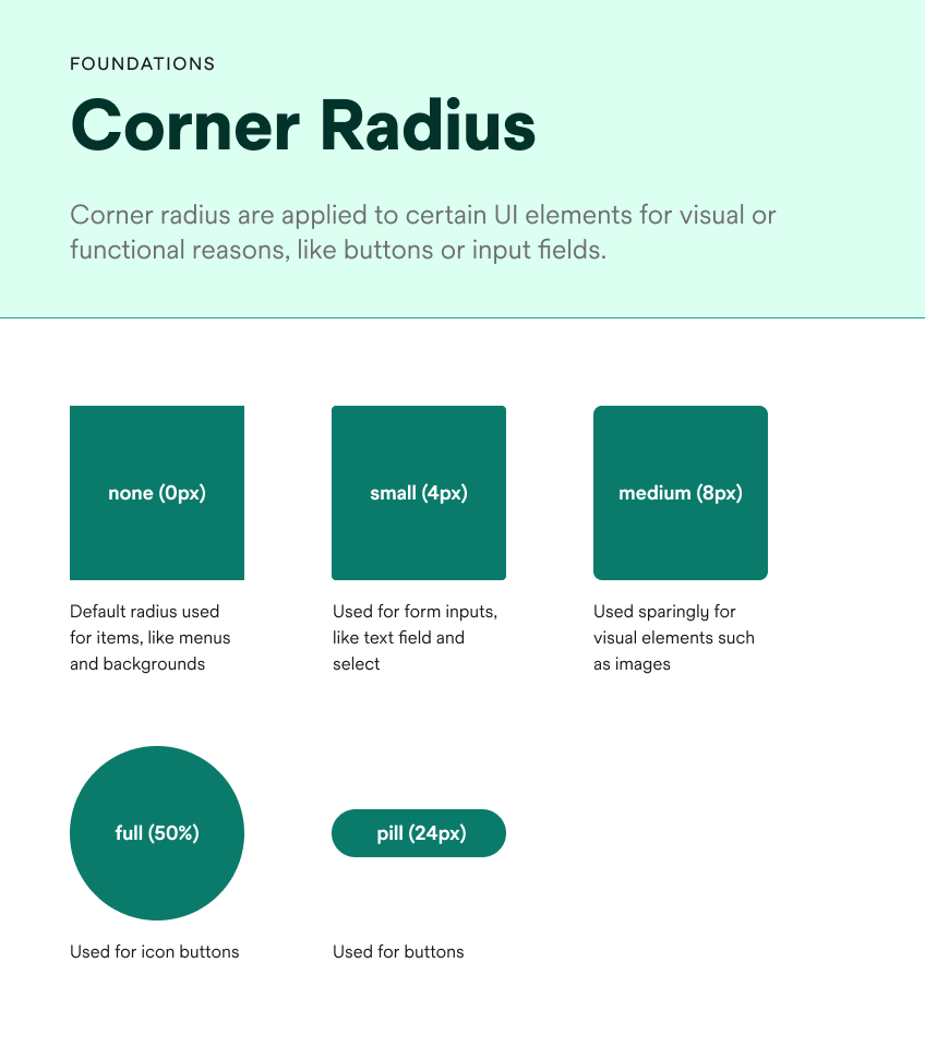
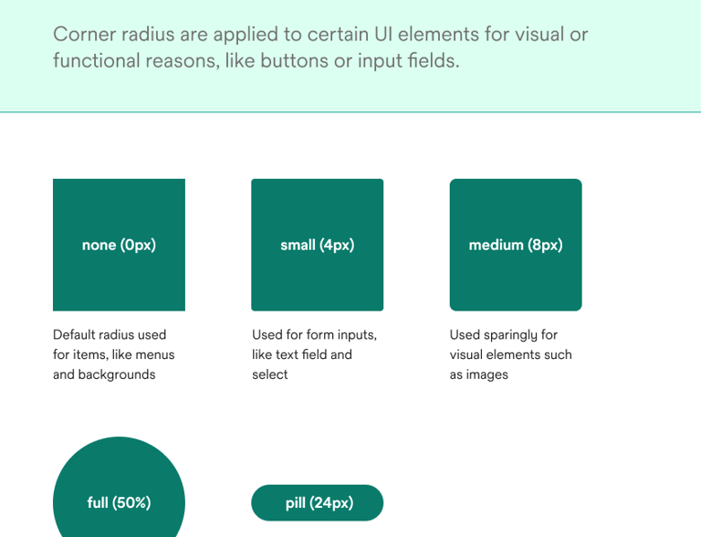
For the best viewing experience, please access this website from a desktop computer. Some features and content may not display correctly on mobile devices.
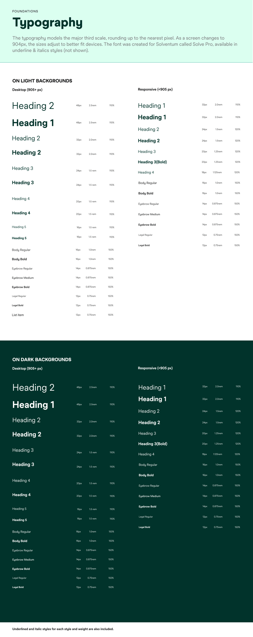
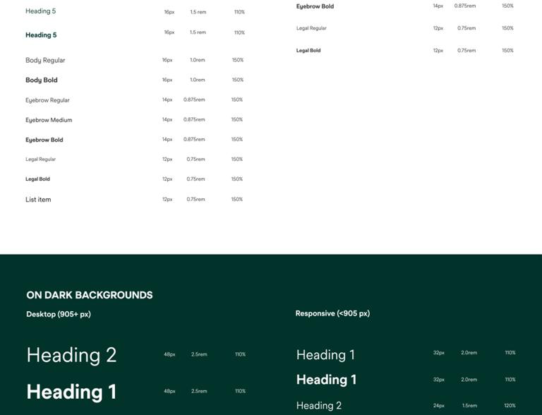
Design in Action Visualizing the Experience
Witness the design system in action through a series of carefully crafted screens. These examples showcase how the system translates into a cohesive and engaging user experience, from initial interactions to core functionalities.
A glimpse into the past
lack of visual harmony, and a suboptimal user experience were prevalent. This fragmented approach hindered efficiency and impacted user satisfaction. Our design system journey began with the determination to rectify these issues and create a unified, user-centric platform.
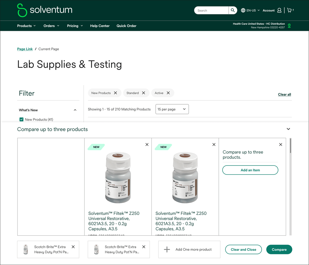
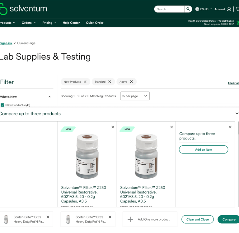
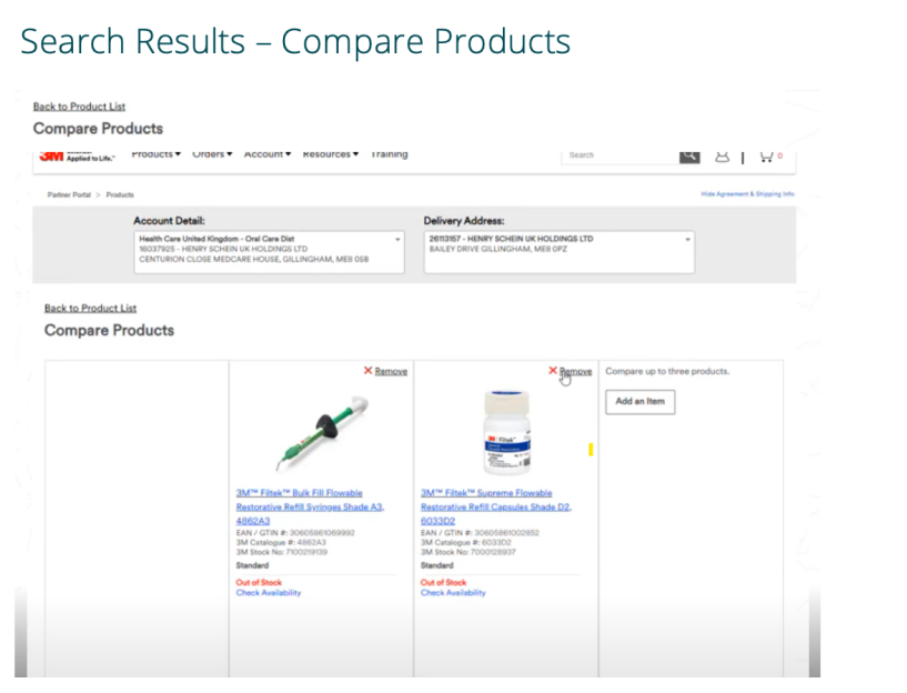
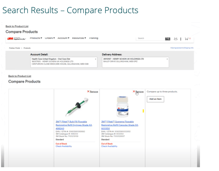
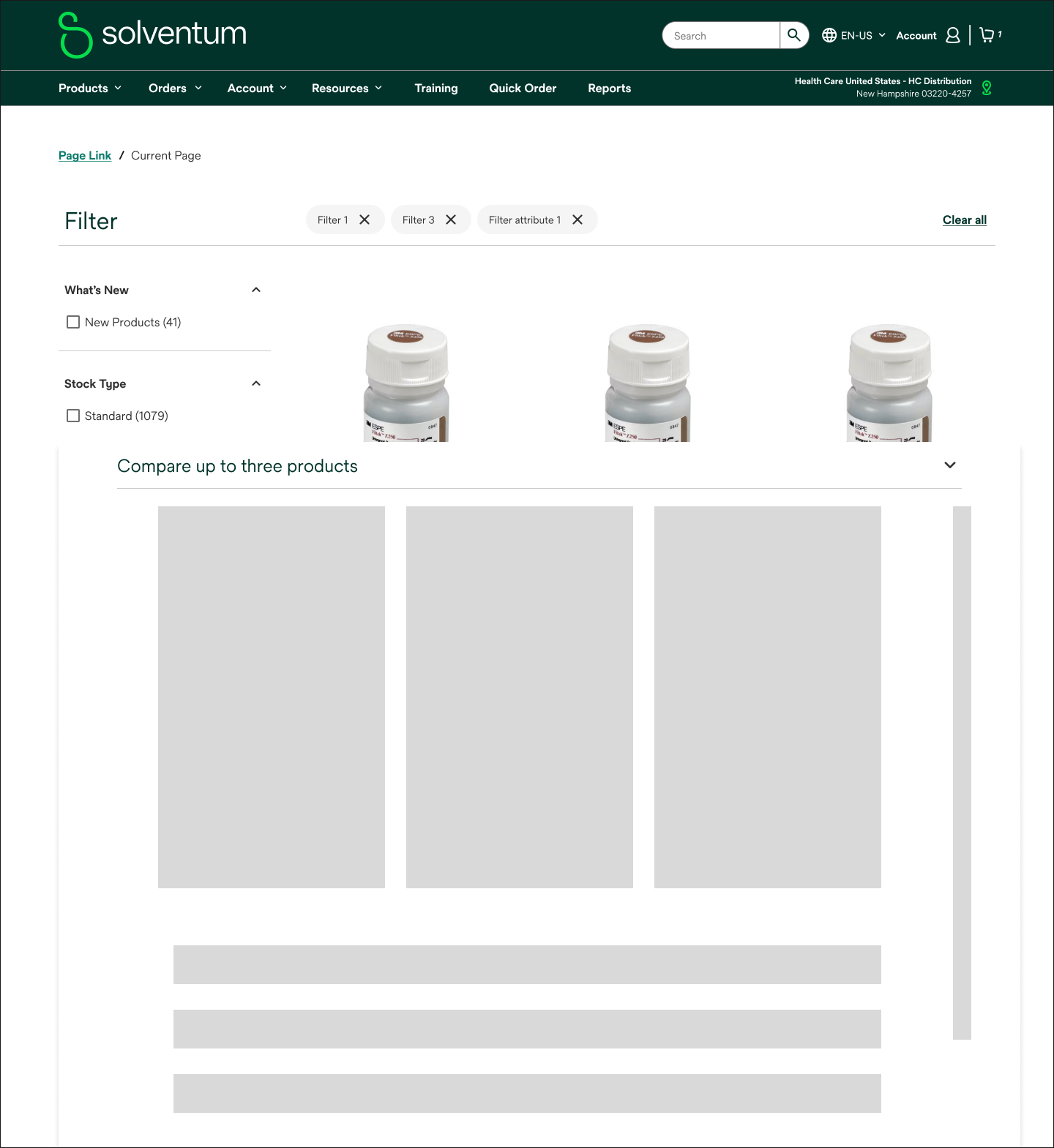
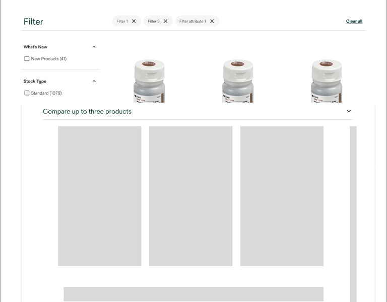
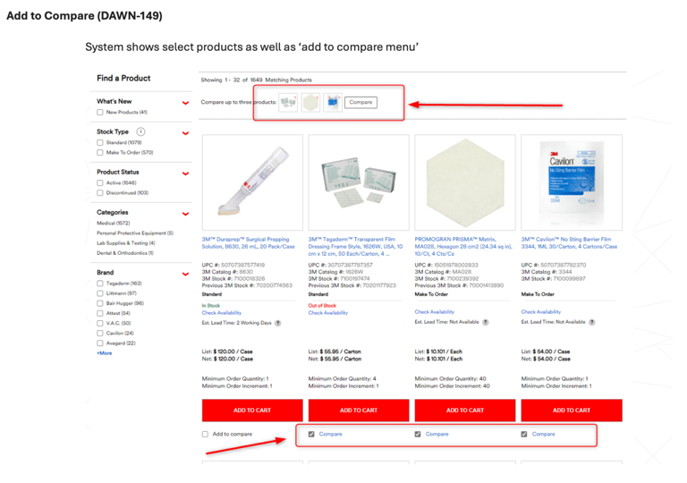
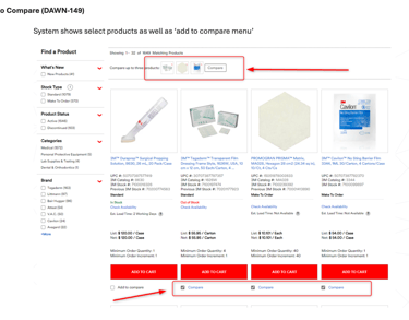
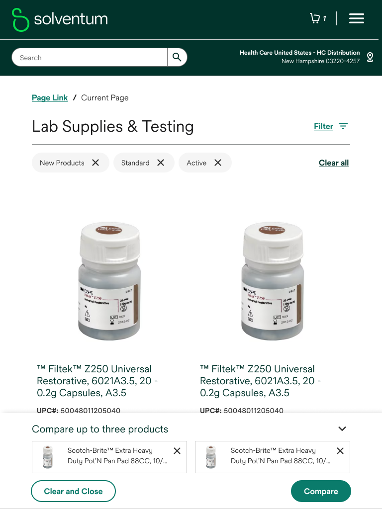
Product Compare Modal
This essential step helped us define the information architecture, user flow, and overall structure of the compare modal. By focusing on functionality and usability, we created a blueprint for the subsequent design phase.


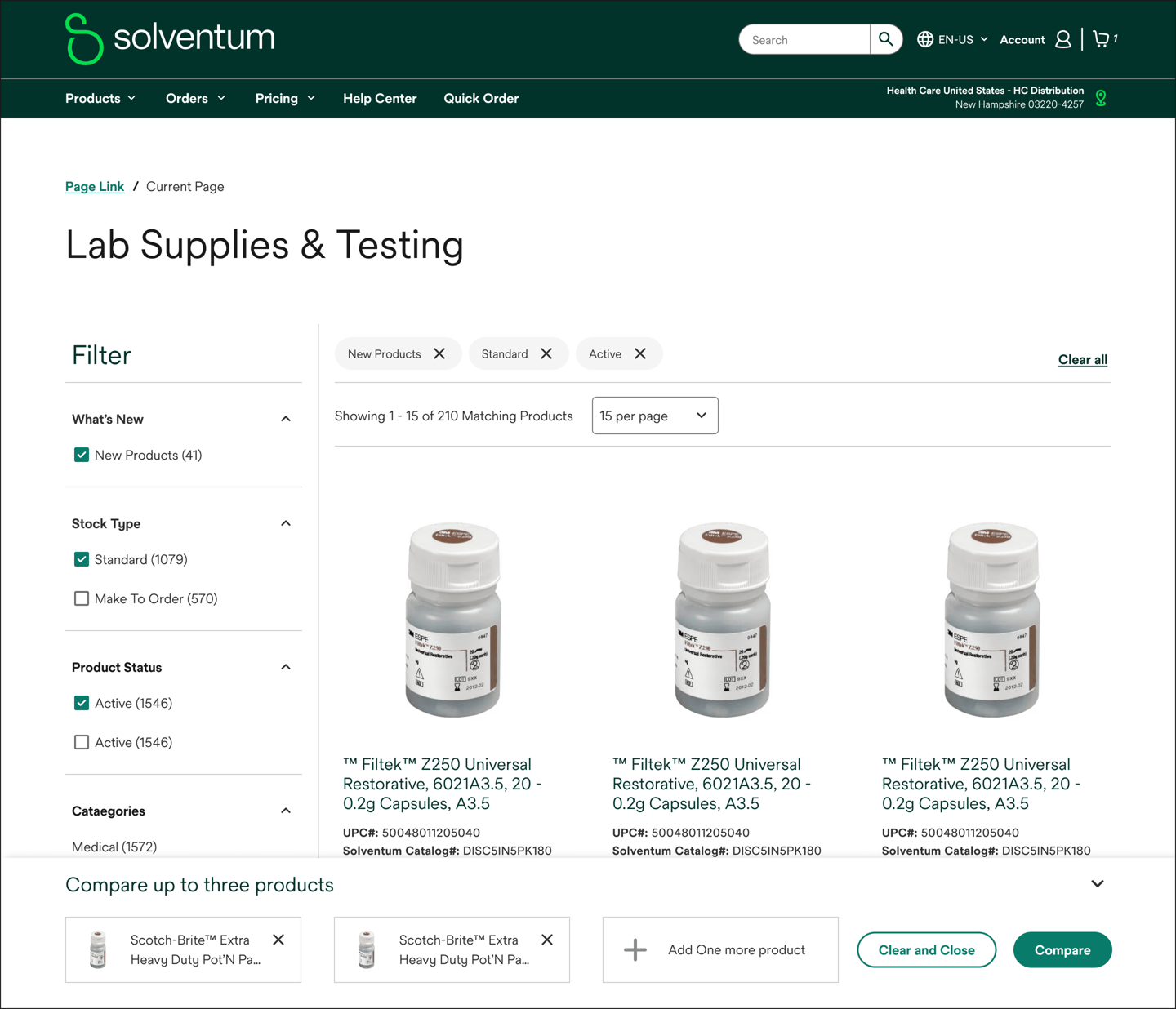
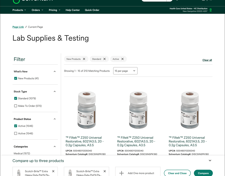
Final Designs Screens

Before diving into the visual design

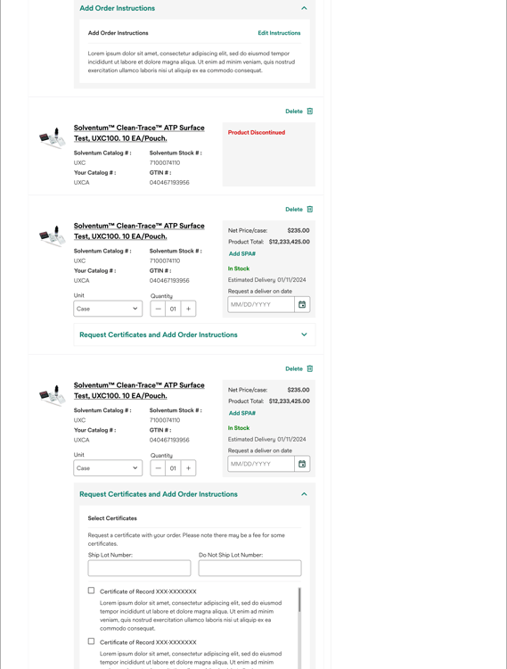
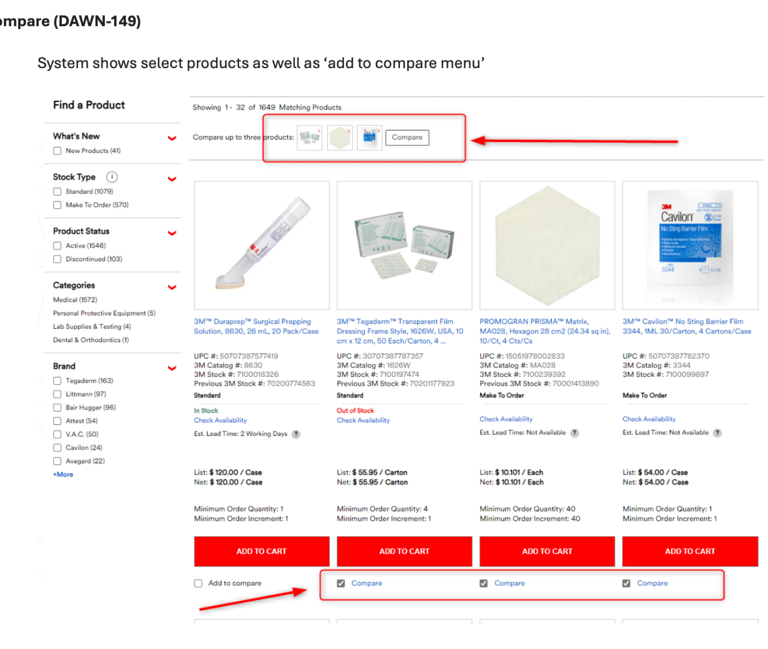
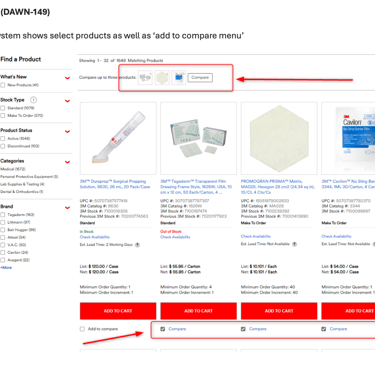
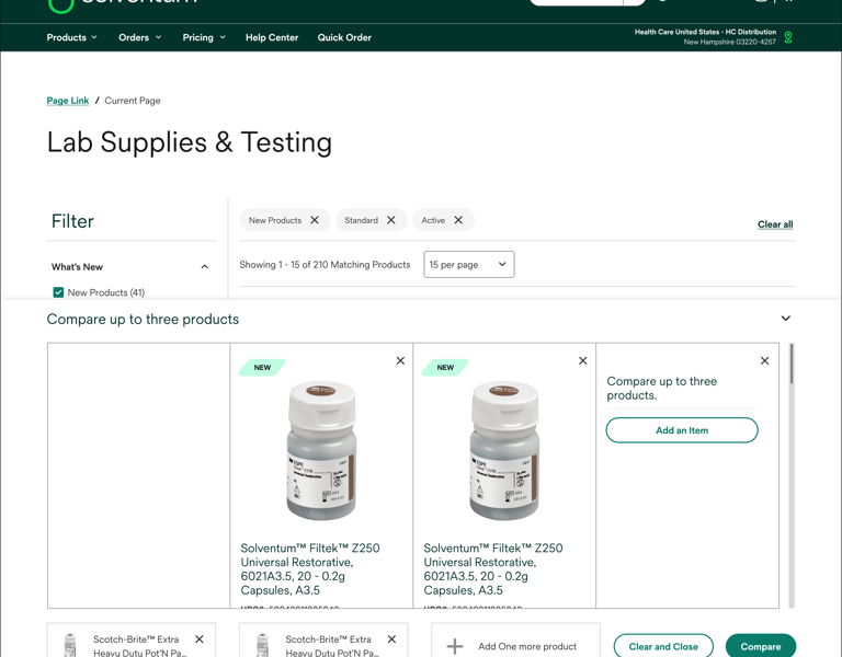
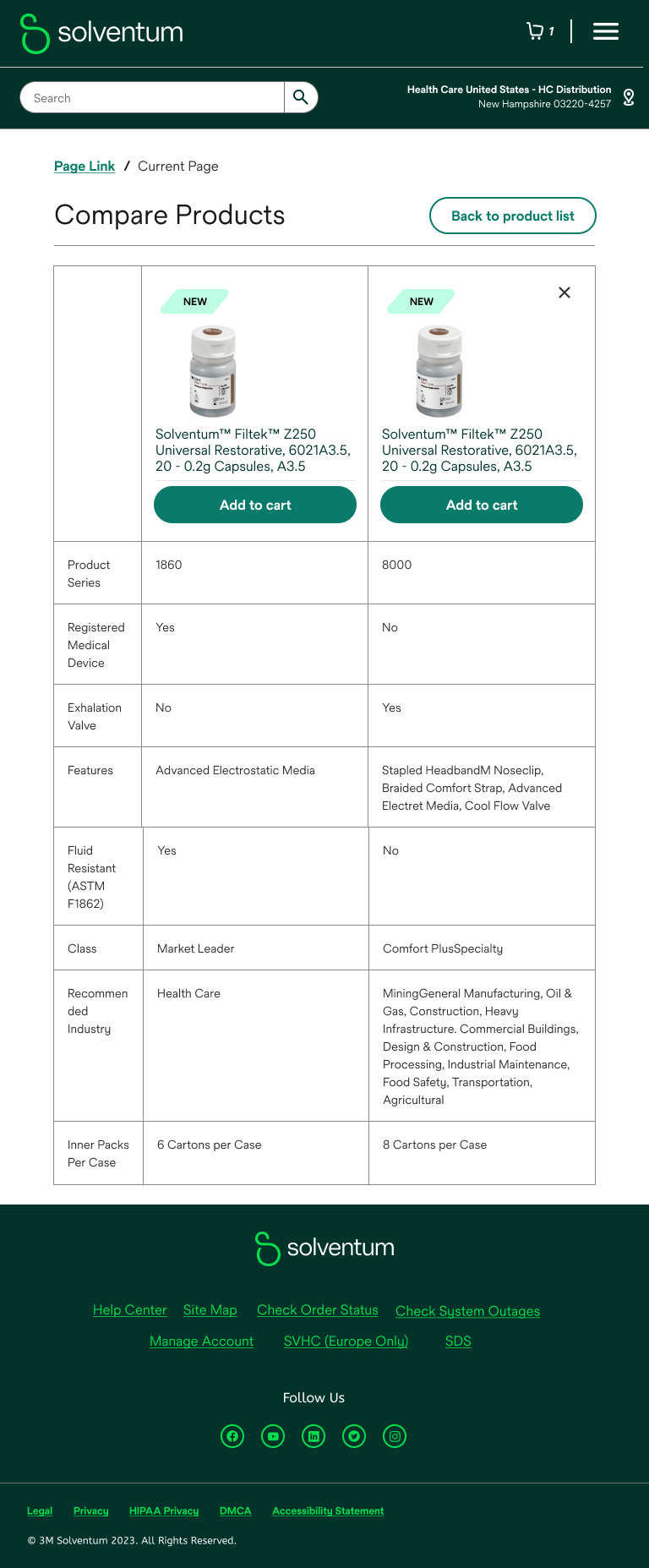
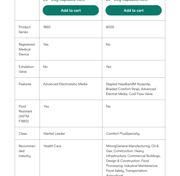
Side-by-Side Comparison
To facilitate informed decision-making, we introduced a sticky comparison section at the bottom of the modal.
This feature allows users to quickly compare key product attributes without scrolling back and forth. By placing essential product details side-by-side, users can easily identify differences and similarities, empowering them to make confident purchasing choices.
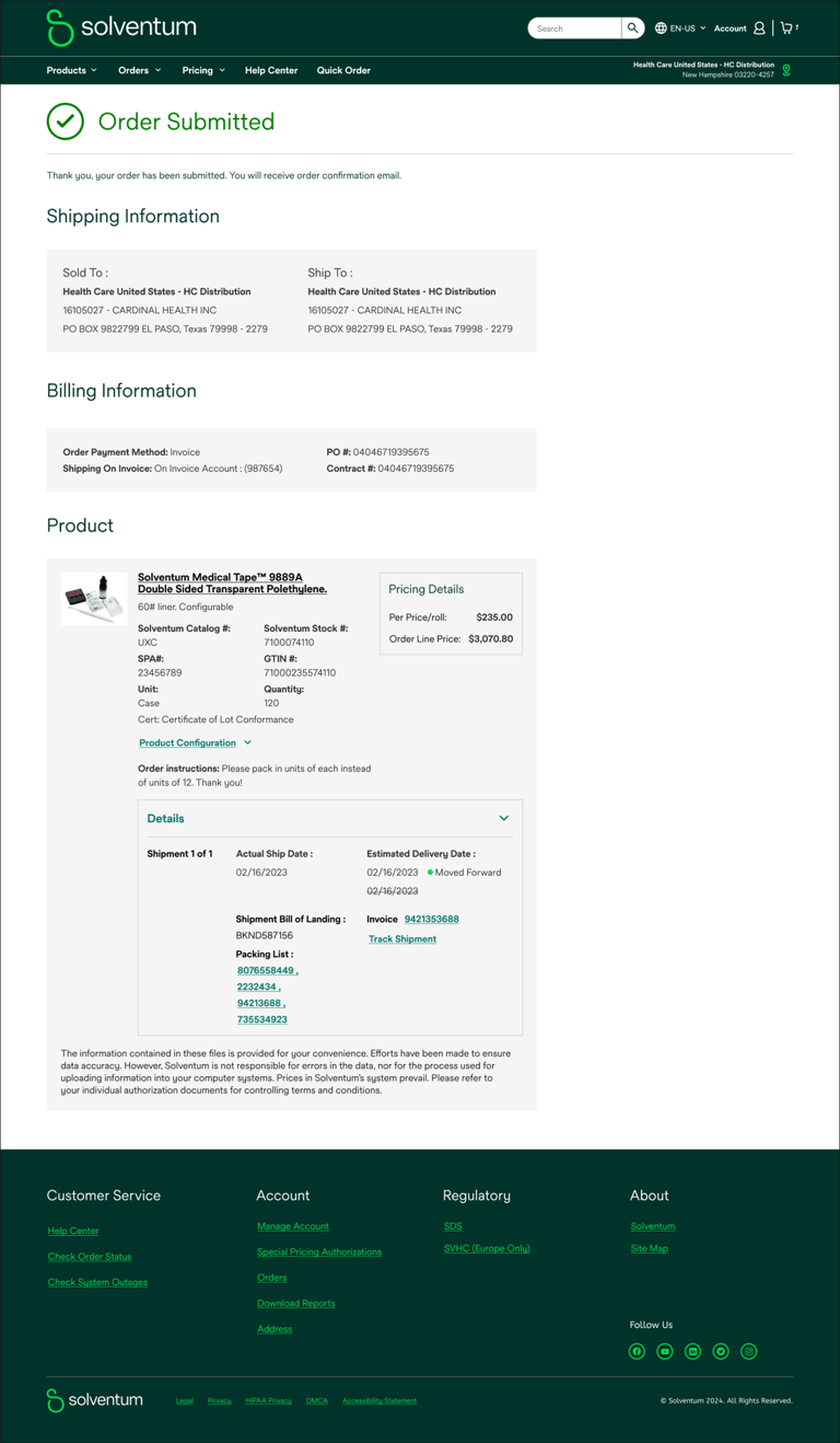
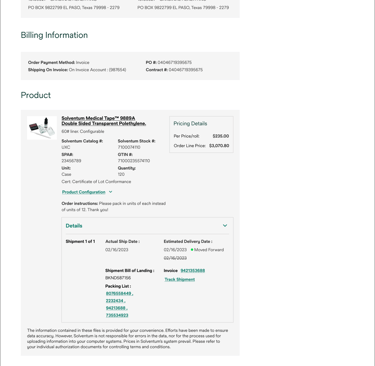
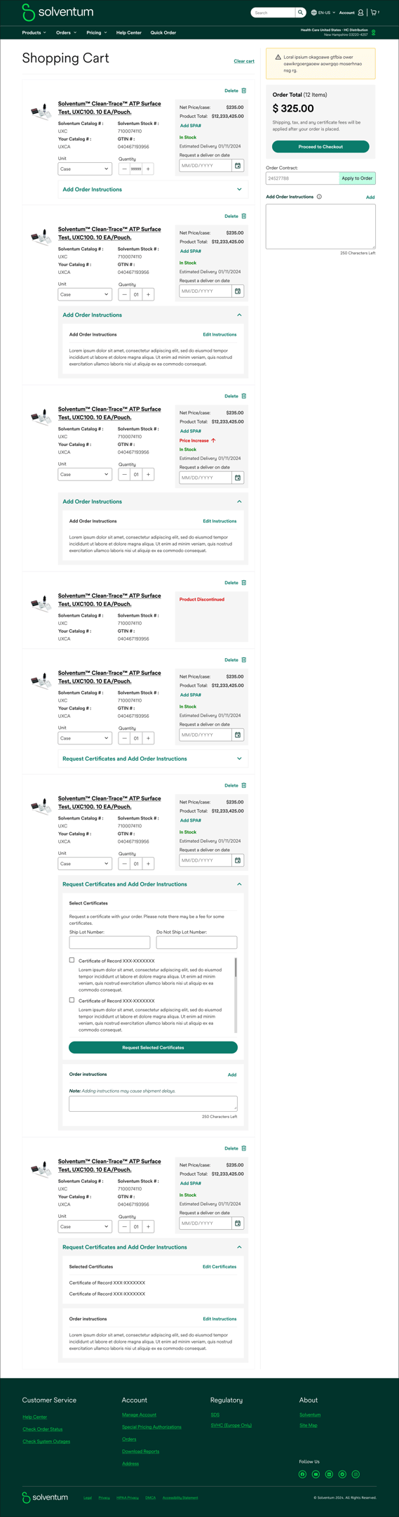
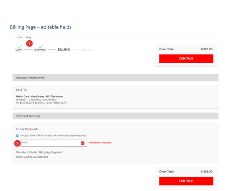
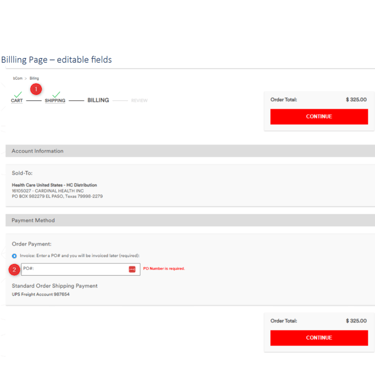
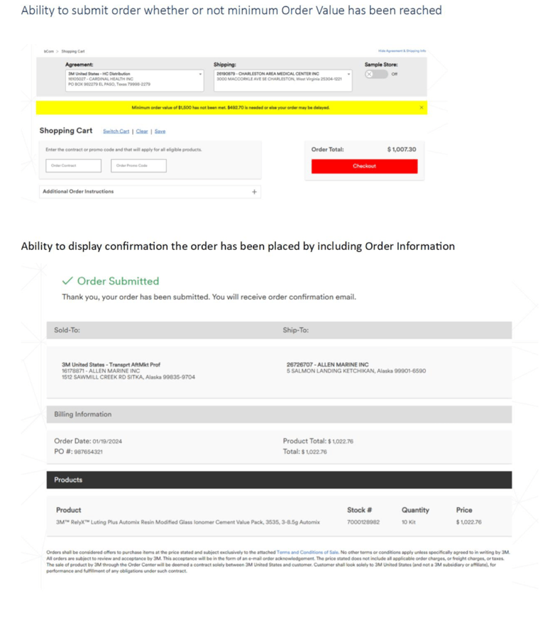
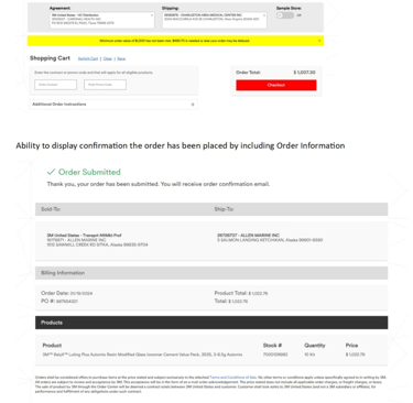
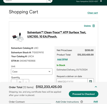
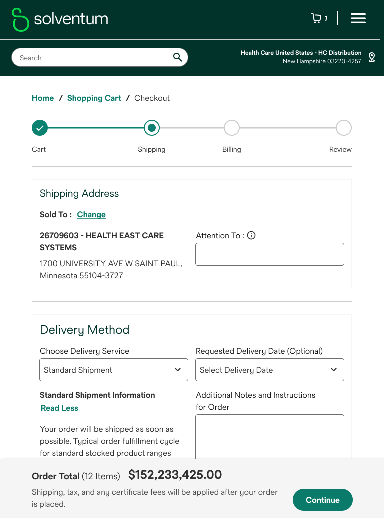
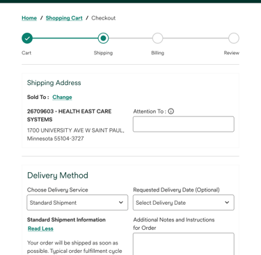
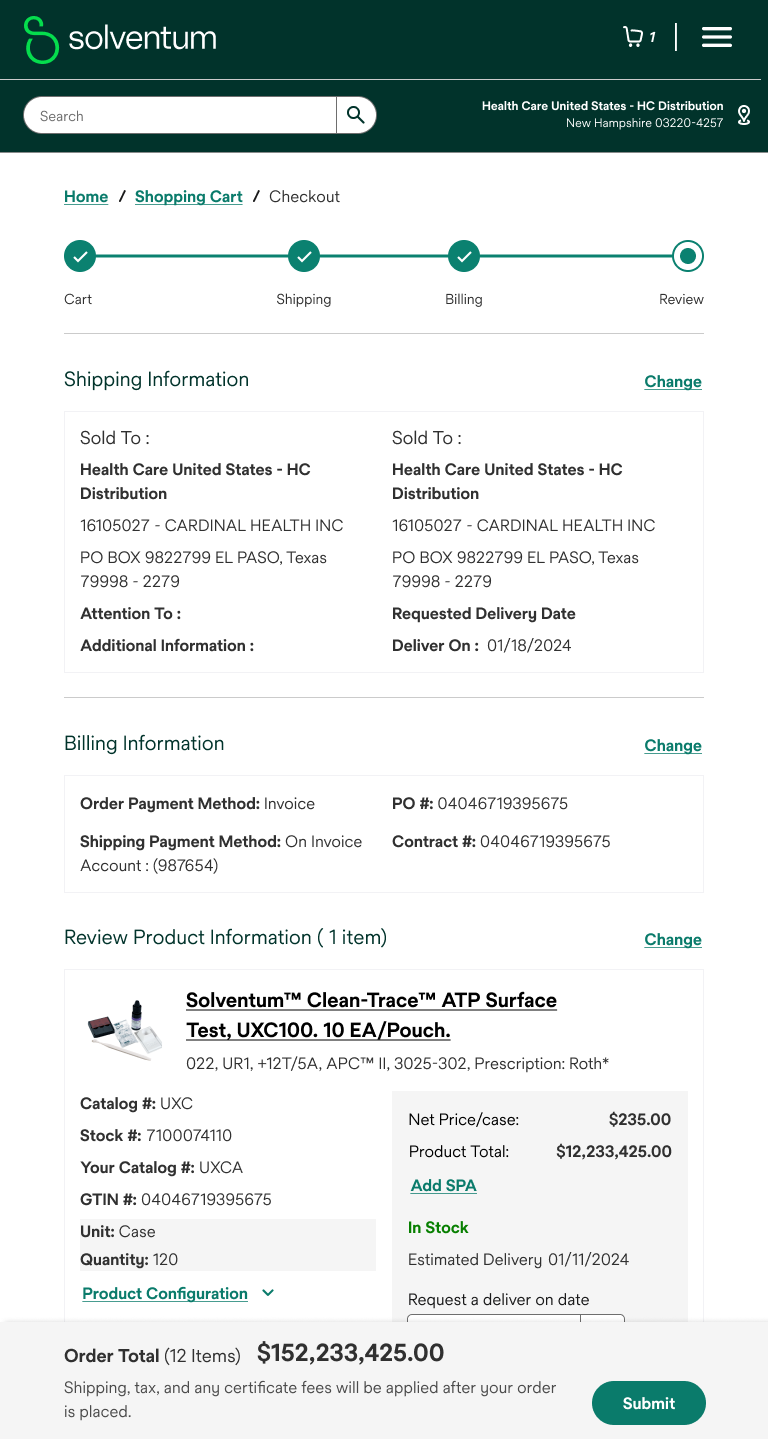
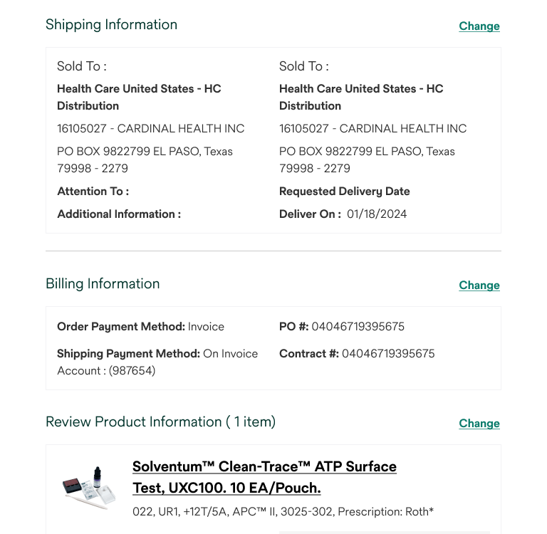
Streamlined Checkout Process
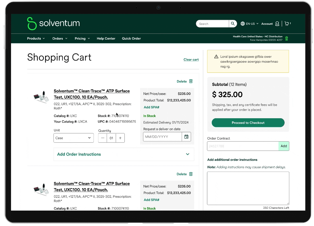
To provide users with constant order visibility, we introduced a dynamic checkout layout.
A fixed order summary is prominently displayed alongside checkout fields, providing real-time order updates. This, combined with a clear, step-wise checkout process (shipping, billing, review), enhances user confidence and streamlines the purchasing journey.
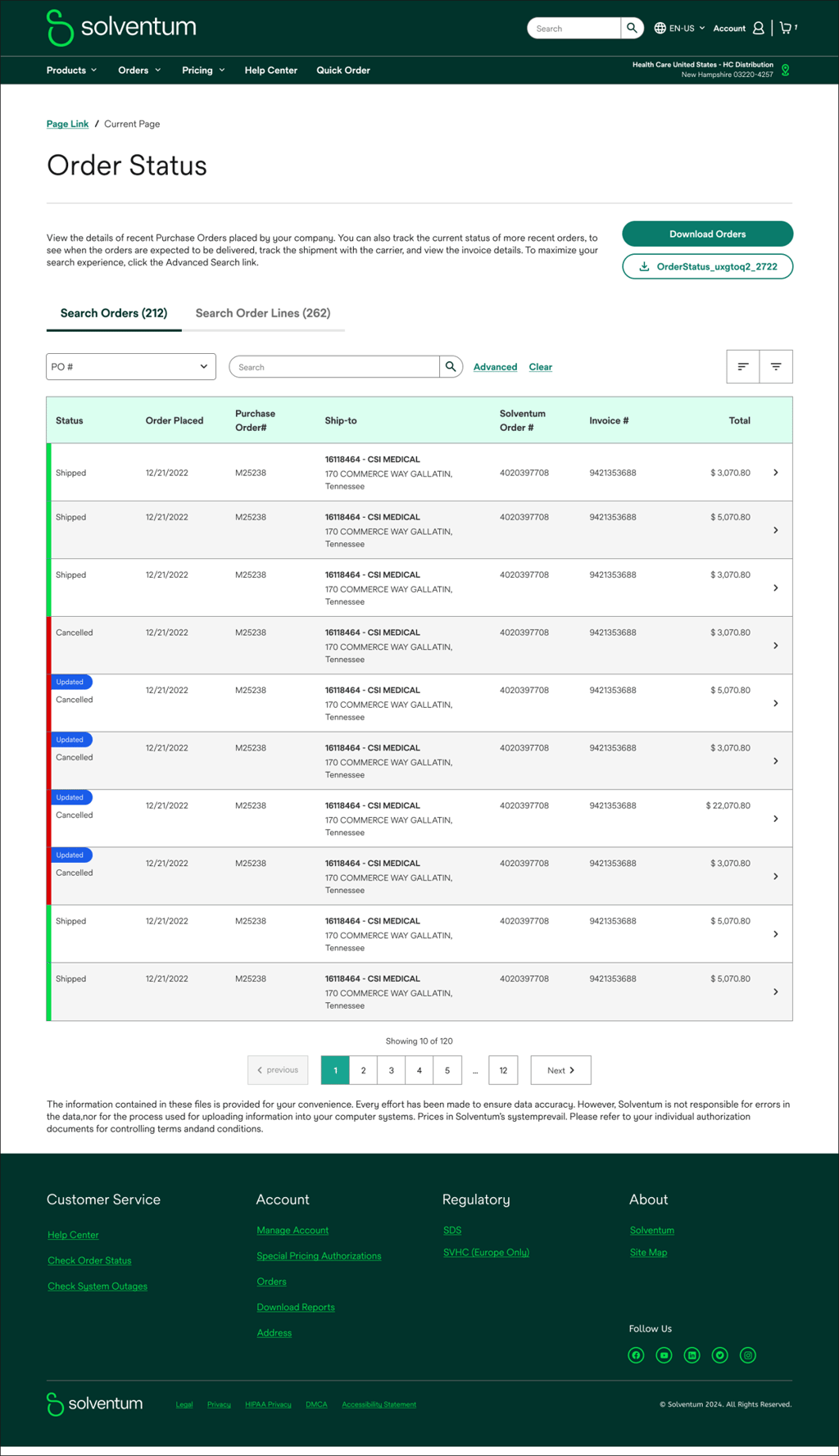
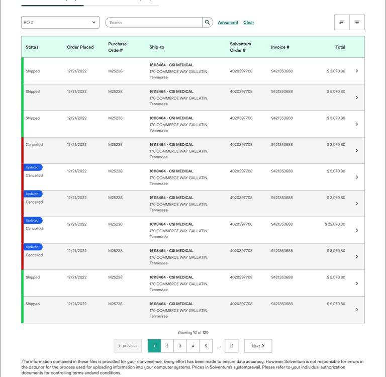
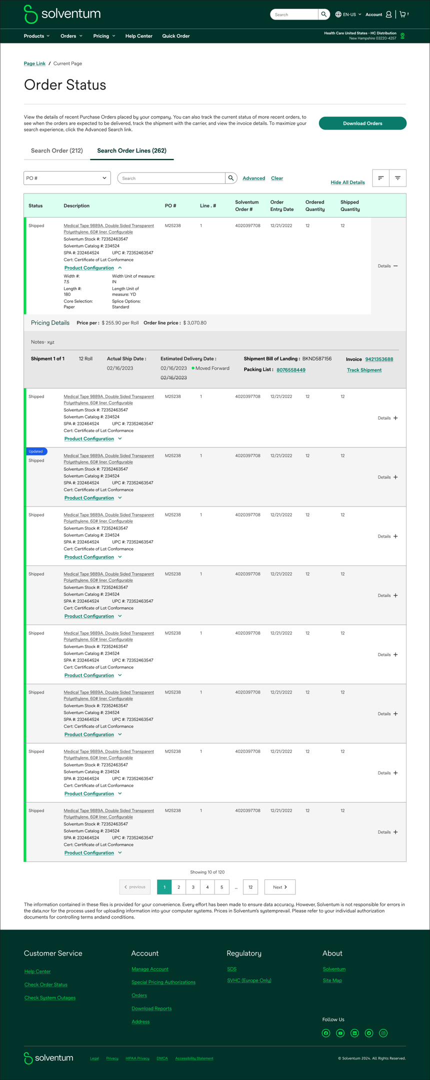
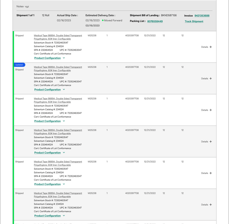
Order Status

Stay informed about your order journey.
The order status section provides a clear overview of your order's progress. With a simple tabular format, you can easily track the status of your shipments, from pending to shipped, or identify any orders that require attention.
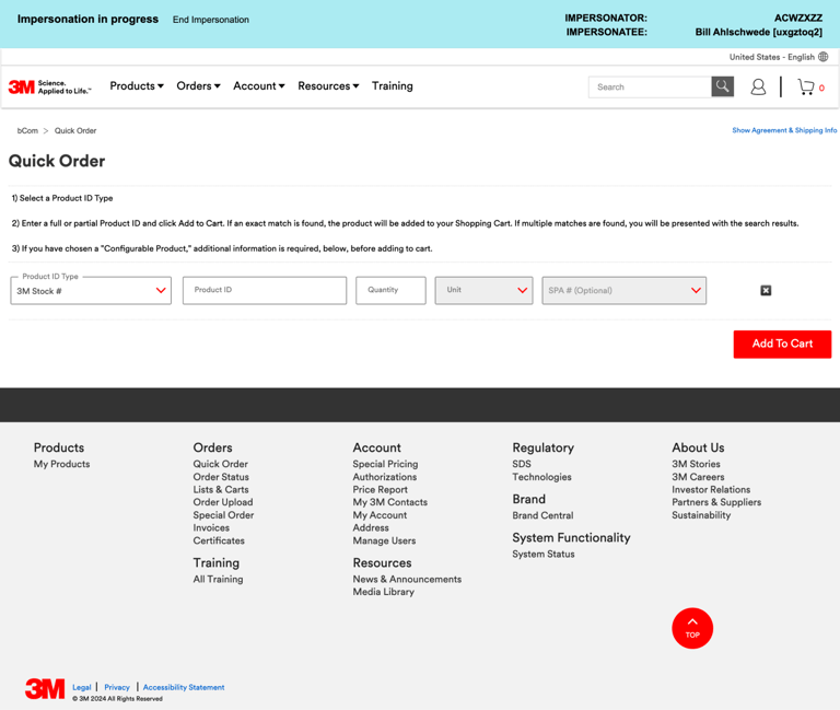
System Status and Order Upload

The system status dashboard provides real-time insights into platform performance, ensuring uninterrupted workflows. Simultaneously, the order upload process is streamlined for efficiency, allowing for quick and accurate order management.
Address

Previously, static address information cluttered our screens. To enhance visual clarity and user focus, we've streamlined the interface by relocating address details to the navigation menu. This minimalist approach creates a cleaner, more immersive user experience without sacrificing essential functionality.
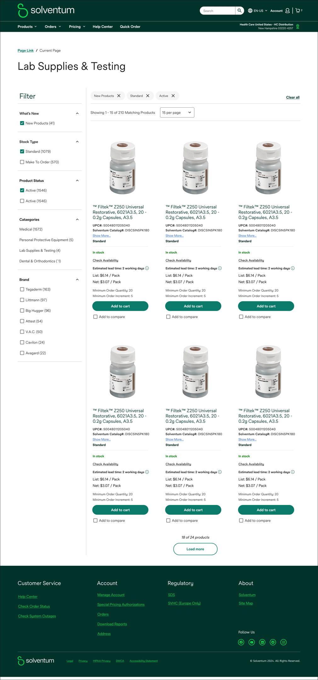
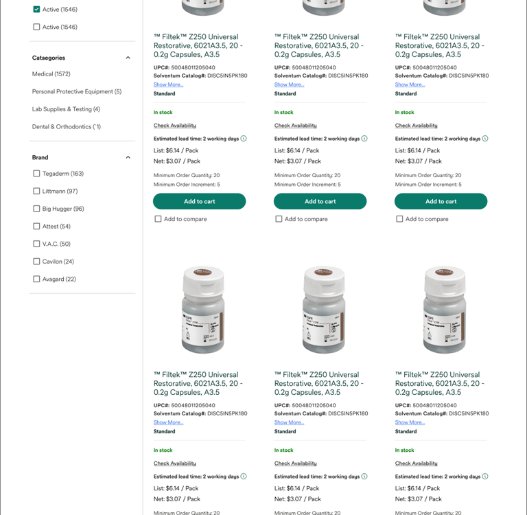
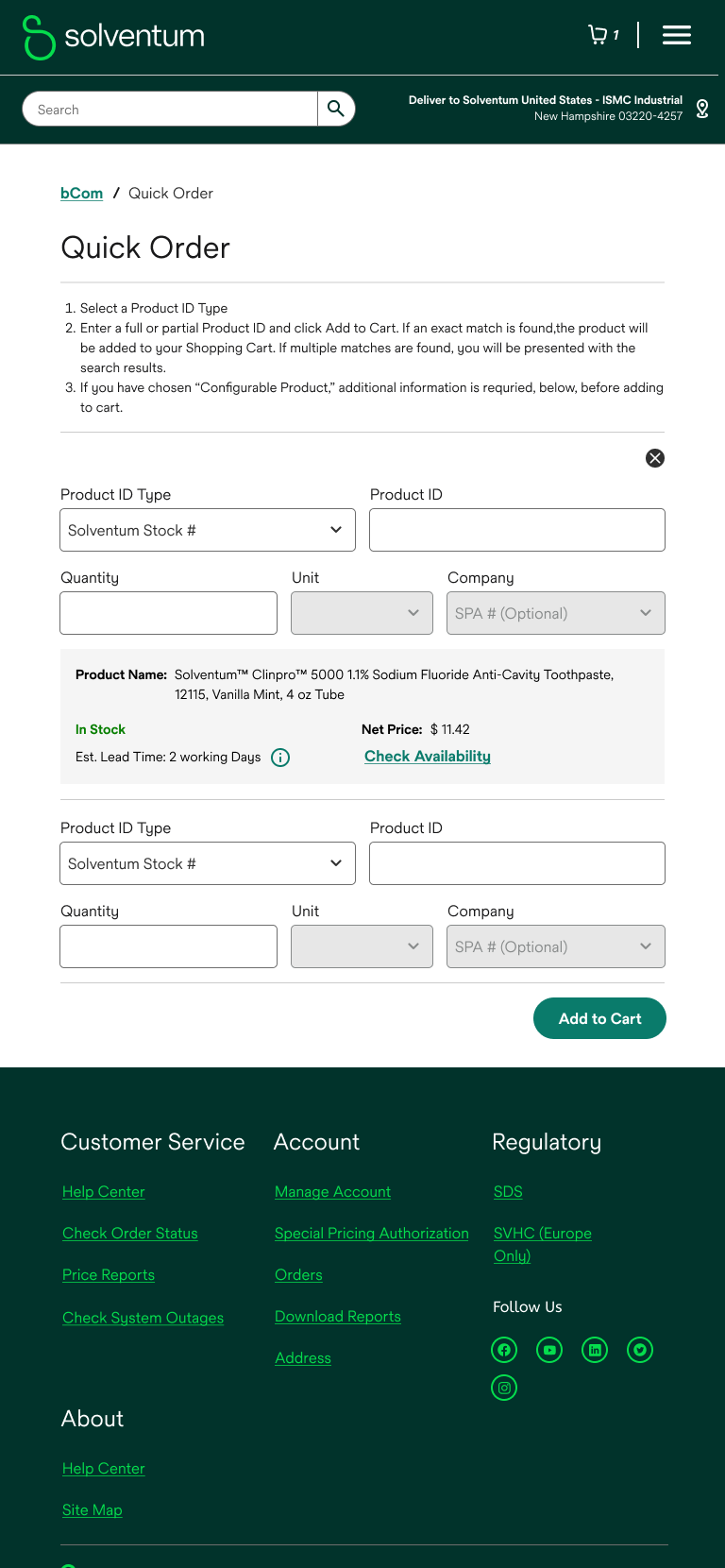
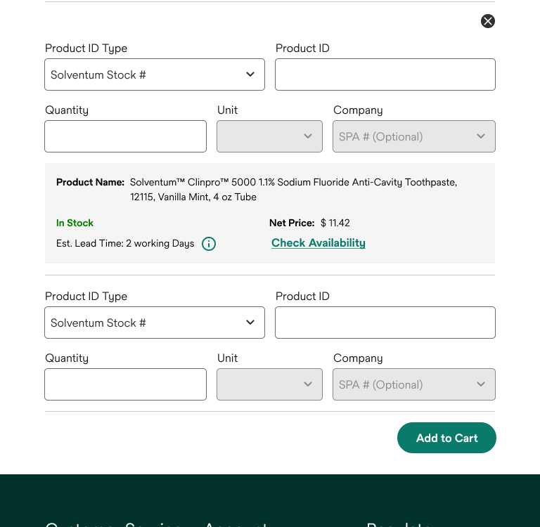
Other Screens
The following screens exemplify the consistent application of our design system. Every element, from typography to spacing, adheres to the established guidelines, creating a cohesive and visually pleasing user experience.
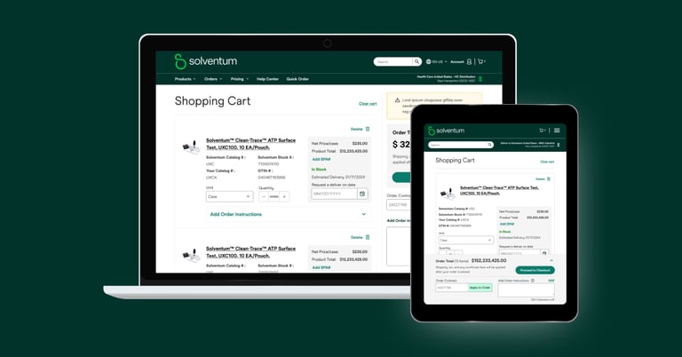
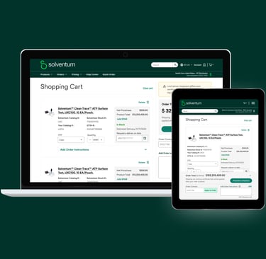
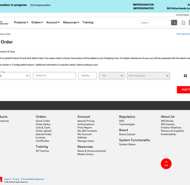
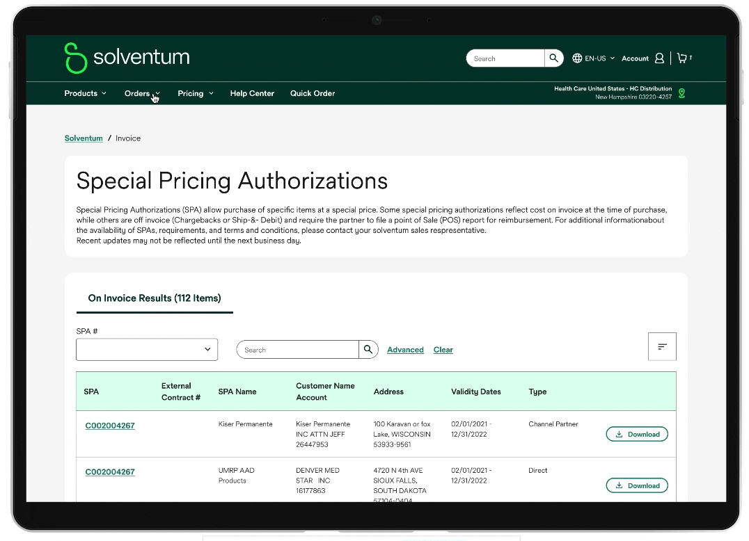
Tablet Adaptive
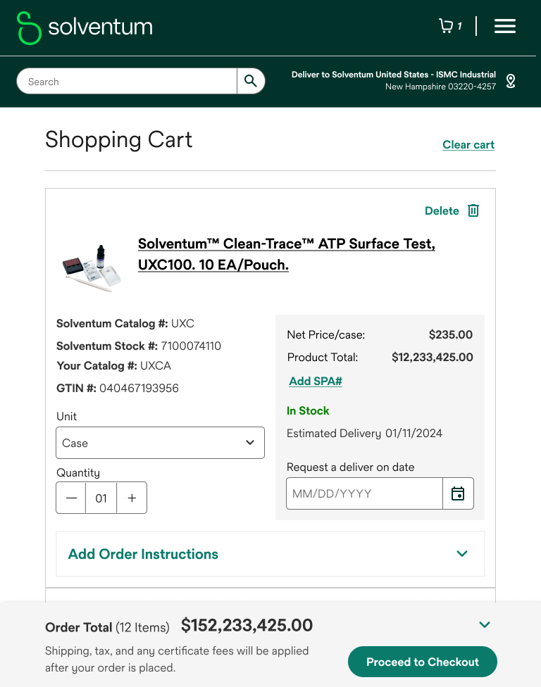
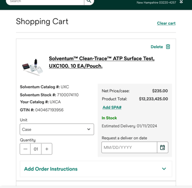
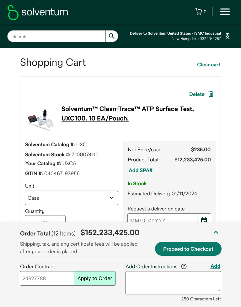
Shopping cart
Check Out
Product Compare
Design Endeavor Concluded
This portfolio showcases a comprehensive redesign that prioritizes user experience and visual harmony. By establishing a robust design system and adhering to user-centric principles, we transformed the platform into a unified and efficient ecosystem. The result is a product that not only meets functional requirements but exceeds user expectations. This project serves as a testament to our ability to deliver innovative and impactful design solutions.